mark marcinik of greenmeadow architects, who did the fabulous update on the 1950's eichler home sent me more photos of his work. i'm in love!
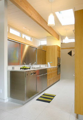
he writes, "ikea is the 21st century answer to the 1950's hardware store... an inexpensive supplier of 'raw' materials. here are my own photos of the seybold house ikea hacks (sunset magazine , april 2007).
 the stainless steel sliding doors aren't custom, they are ikea cover panels hung on sliding door tracks.
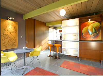
 the bar is made of doors parts and three cabinet boxes and more cover panels. the translucent window in the red wall is an ikea door.
 this bathroom counter was made out of bits and pieces of ikea boxes, doors and hardware. the top is industrial plastic from another great material source... mcmaster-carr. the sink was originally a stainless steel salad bowl but after the house won a 'home of the year' award we thought we needed to upgrade it. the lighting fixture was salvaged from a 1950's eichler house and refurbished. the magazine metropolitan home
 never used this picture because they thought it looked too scary. the scary painting is by artist judy gittelsohn. the coffee cups and bowl are from vintage 1970's thrift store, heller .
 in this other ikea hack, we used ikea kitchen cover panels to panel the kitchen and dining room walls and construct a matching door and create a bar type area and an art display niche."
photos and design by mark marcinik, greenmeadow architects.
he writes, "ikea is the 21st century answer to the 1950's hardware store... an inexpensive supplier of 'raw' materials. here are my own photos of the seybold house ikea hacks (sunset magazine
 the stainless steel sliding doors aren't custom, they are ikea cover panels hung on sliding door tracks.
 the bar is made of doors parts and three cabinet boxes and more cover panels. the translucent window in the red wall is an ikea door.
 this bathroom counter was made out of bits and pieces of ikea boxes, doors and hardware. the top is industrial plastic from another great material source... mcmaster-carr. the sink was originally a stainless steel salad bowl but after the house won a 'home of the year' award we thought we needed to upgrade it. the lighting fixture was salvaged from a 1950's eichler house and refurbished. the magazine metropolitan home
 in this other ikea hack, we used ikea kitchen cover panels to panel the kitchen and dining room walls and construct a matching door and create a bar type area and an art display niche."
photos and design by mark marcinik, greenmeadow architects.


Post A Comment:
0 comments:
Post a Comment