some eye candy to start off the week. this cool pad once looked like a dorm room. thanks to denise, the girlfriend, the place is completely made over.
 "for my boyfriend's birthday, while he was away for about a week, my friends and i made over his place. it used to look like a college dorm but is now a chic looking bachelor's pad. i wish i had pictures of the before but i wanted to start ASAP and forgot! me and my friends are students at the Art Institute of San Francisco. studying interior design! no wonder, huh? he was very surprised and thrilled. he still has a hard time believing it's his place.
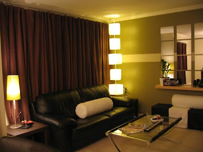 everything was from ikea except the couch, curtains, and coffee table. i didn't want to buy any new furniture because it wasn't economical or green so we had to be clever. he already had the furniture but it wasn't in the finish he wanted, so i used walnut woodgrain contact paper (the kind you cover pantry shelves with) to cover them. it was a bit tricky to use and to make sure it was cut properly, we used a very sharp blade. i bought about 20 rolls of the stuff and we used every single piece - on the side tables, media bench, book shelves.
to create visual interest, an accent wall and focal point was made. he has no fireplace and no lighting (except for the dining room light). all the light fixtures are fluorescent.
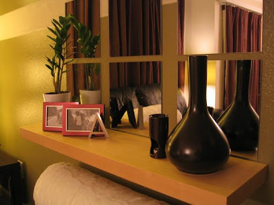
 we used a curtain hung from the ceiling with anchor brackets to section off a reading area and the living room. all of the accessories were found from the 'as-is' department. with a little careful space planning, this was our result.
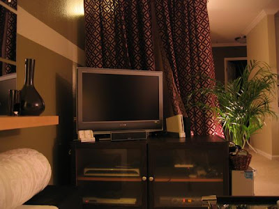
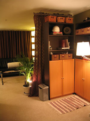 here is a link to more photos (but you'll need to log-in to myspace to view them)
 "for my boyfriend's birthday, while he was away for about a week, my friends and i made over his place. it used to look like a college dorm but is now a chic looking bachelor's pad. i wish i had pictures of the before but i wanted to start ASAP and forgot! me and my friends are students at the Art Institute of San Francisco. studying interior design! no wonder, huh? he was very surprised and thrilled. he still has a hard time believing it's his place.
 everything was from ikea except the couch, curtains, and coffee table. i didn't want to buy any new furniture because it wasn't economical or green so we had to be clever. he already had the furniture but it wasn't in the finish he wanted, so i used walnut woodgrain contact paper (the kind you cover pantry shelves with) to cover them. it was a bit tricky to use and to make sure it was cut properly, we used a very sharp blade. i bought about 20 rolls of the stuff and we used every single piece - on the side tables, media bench, book shelves.
to create visual interest, an accent wall and focal point was made. he has no fireplace and no lighting (except for the dining room light). all the light fixtures are fluorescent.

 we used a curtain hung from the ceiling with anchor brackets to section off a reading area and the living room. all of the accessories were found from the 'as-is' department. with a little careful space planning, this was our result.
 here is a link to more photos (but you'll need to log-in to myspace to view them)


Post A Comment:
0 comments:
Post a Comment